Interior decorating is expensive. If you’re living on a budget, you have to get creative, especially if you’re a transient renter who may not be planning on calling an apartment home for long. That’s been my approach to apartment design. Aside from Ikea necessities, many pieces in my apartment were not purchased from stores, rather creatively procured to fit a New York City budget. There are a couple items I found at yard sales and a few from Craigslist. I even built my “couch” by hand using a bunch of 2x4s and a youtube tutorial. Only a few of these finds are what one would call “art” or “decorative.” In fact, until recently my walls have generally been bare. So when I saw cool-looking poster designs on Etsy a few years ago and envisioned them adorning my walls, I held off on buying them because I didn’t want to buy something so…nonessential.
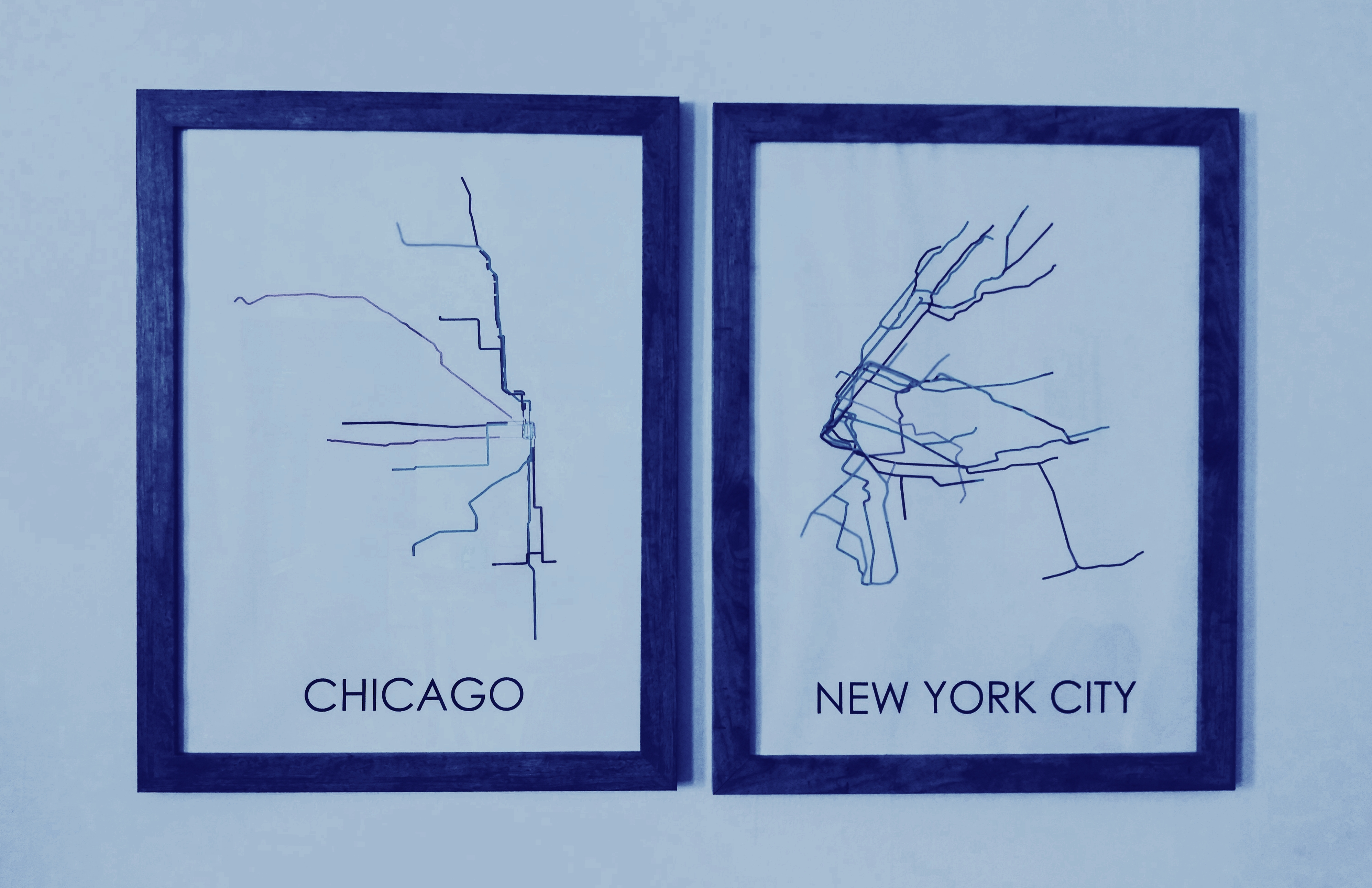
Having grown up in Chicago before moving to New York City, I thought it would be encapsulating to have large framed illustrations of Chicago’s CTA “L” lines and New York City’s MTA subway routes mirroring each other on the wall. These transit maps are pretty popular on Etsy. But I hesitated to make the investment (who knew how long I’d keep them before moving somewhere else and having to give them away). But after about three years of living with naked white walls and finding a decent apartment, it was time to upgrade. I logged back onto Etsy to find the maps, but was quickly dismayed.
First of all, only a few Etsy “shops” offered maps for both Chicago and New York, and only a few had the size I wanted (18×24). And no matter who was selling them, most ran about $50 a piece. I wanted to decorate my walls, but really didn’t want to pay $100 plus shipping and framing for something I still secretly feel is a tad bit superfluous and extraneous for a small apartment. I was ready to give up, until something clicked:
Transit systems are usually public or semi-public entities. Maps are data. Transit maps are usually public data, and almost any kind of public record is easily accessible online, nowadays. Chances are there is publicly available geographic data for almost any major metropolitan transit system in the world, I thought, certainly for New York City and Chicago. So why not create my own subway route posters using public transit data…for free?!
All I’d have to do is find geospatial data of Chicago’s and New York’s transit systems, visualize that data in QGIS (a software program for analyzing geospatial data), then transform the visualization into poster art using something like Adobe Illustrator. It turned out to be a fun project that ultimately saved me a ton of money, while boosting my pad closer to mature adult status.
Here’s how:
Wrangle the data:
Finding the data was the easy part. A google search of “Chicago CTA shapefiles” and “NYC MTA shapefiles” took me directly to the cities’ online data portals, which had the shapefiles for download.
I wanted the posters to maintain the proper color schemes, so I also googled the official colors for each subway route. Those were readily available on their respective transit authority’s websites for developers and designers. I bookmarked the pages for future reference.
Clean and visualize the data in QGIS:
I added each shapefile as a vector layer in a new QGIS project. This displayed the subway systems’ line segments and points on the QGIS map display area. This is when I realized that most transit maps of NYC’s MTA train system, including the official map, are geographically misleading. The island of Manhattan is geographically angled from northeast to southwest, but most posters, including many of the ones on Etsy, depict it as going straight up and down, from north to south. Brooklyn, Queens and Staten Island are thus also distorted, but I digress.
As you may or may not know, shapefiles usually include an attribute table containing various data fields for each line segment, shape, and point on the map. That means each line segment that made up the transit map was represented by a record in the attribute table.
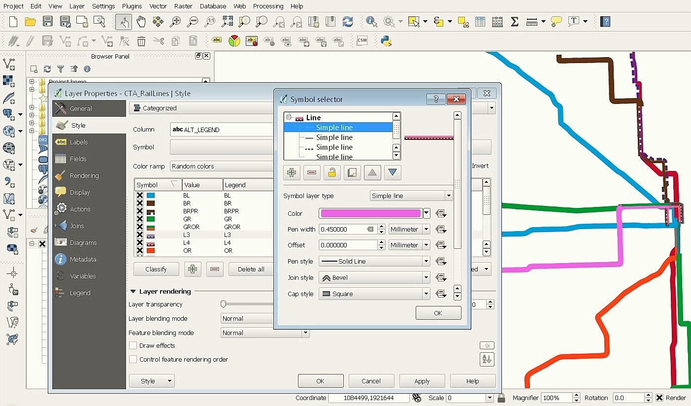
By default, the lines on my map were the same color. To color-code the lines so that they represented the different subway routes I right-clicked the shapefile in the layers panel, opened “Properties” and headed to the “Style” menu. This let me color-code each line on the map based on a value in the attribute table. I did this by selecting “categorized” in the topmost dropdown menu and selecting the attribute/field from the attribute table that represented the name of the subway line each segment belonged to. Selecting “classify” automatically sorted the segments by value, and assigned each group a random color. I could then click on each category and change the color, using the official HEX values I found online.
I wish that was all there was to it, but it was not that easy. The CTA map is tricky. It has several lines that overlap one another, especially in the “Loop,” where multiple train lines run on one track. For the Loop in particular I had to make the line segments thinner than the other segments in the map. The official CTA map also does this. For lines that overlapped, I also needed to adjust their “offset” values so that the lines were next to one another rather than on top of one another.
With the lines color-coded and sized the way I wanted, it was time to export each map as an image. QGIS’s Print Composer conveniently turns geospatial visualizations into PDFs and SVG files. Since most commercial printers prefer PDF files, I could create and publish the entire poster from within QGIS.
I opened the Print Composer from the “Project” menu. There I could set a paper/poster size (18×24), change the dpi to 300 (more on this later), add text, and, most importantly, add the geospatial image I created (select “add map”).
I added the image, as well as text (the name of the city), and was ready to export. But then I realized I wanted more control and flexibility over the design and export options. So instead of saving as a final PDF, I deleted the text, re-sized the image to fill the entire workspace, and exported the maps as SVG files.
Design a graphic with Illustrator:
With an SVG file of each transit map, I was able to open and edit the files in Adobe Illustrator. I could alter the look and feel of the poster, including the style of the lines and the typography.
First, I created a new project and sized the document to 18×24 inches. I made sure to select “CMYK” as the color mode for the project. This is the color mode commercial printers use, rather than “RGB,” which is more suitable for digital. I then imported the image using Illustrator’s “Place” command, and added text.
For Illustrator images to look good in print, I had to change the resolution. For a number of reason the resolution for print files should be 300 DPI (or PPI). This represents the number of dots per inch the printer will use for the image. The lower the number, the less dots, and the more blurry the image looks. 300 dpi is industry standard.
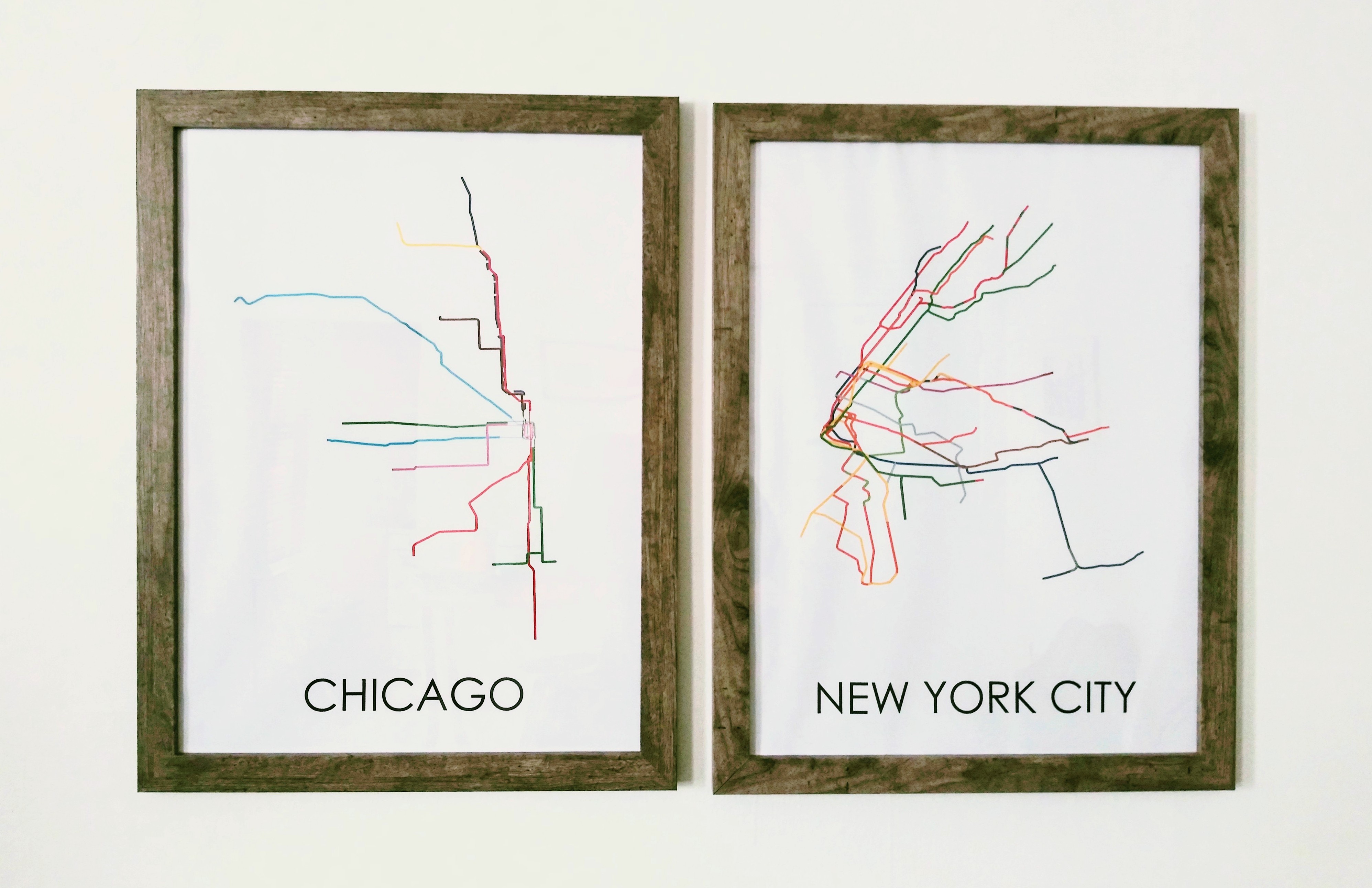
Now that the project was set up, it was time to tweak the lines (QGIS leaves the lines looking pretty generic and blocky). I opened the “Layers” panel in Illustrator and deleted any blank layer, which created random whitespace in the image and covered some of the lines (for some reason there were a lot of these). I had to ungroup some of the lines to do this. From here I was able to edit the width of each line segment or group them, including the tricky Loop portion of the CTA map. Illustrator also let me alter the shape and style of the lines to give them a more artistic, polished look. I ended up making the CTA Loop lines even thinner than I had in QGIS.
I re-sized the image to fit the poster, while leaving some “bleed” around the border (at least a quarter of an inch).
After playing around with the design, I was ready to save the image as a PDF file. This opened a window with various print options. Most Illustrator downloads have presets with pre-selected options for various common outputs. Normally for posters, I’d use the “Print Quality” preset, which uses 300ppi bicubic downsampling. But my installation of Illustrator didn’t have this preset, so I did it manually. More on those print-ready options here.
Publish/print the graphic:
With a finished PDF file of my posters I was ready to print them. Commercial printers are motley. There are online printers, large-scale printers, chain printers and easy-to-miss neighborhood printers to choose from. I decided to use Vistaprint (an online option) because it’s notoriously affordable with routine discounts and sales. I have also printed business cards with Vistaprint before and was satisfied. An 18×24 premium matte print of my posters was $15 each, on sale from $19.
However, I was not completely satisfied with the results. The poster looked okay, but not what I had expected. Vistaprint’s premium matte paper was very thin and the colors looked dull. The quality seemed low. If I were to use Vistaprint again, I’d choose the premium glossy option instead. It’s the same price as the matte, but with a more traditional glossy poster feel and perhaps with more vivid and solid colors.
After a back-and-forth with Vistaprint (not only did I not like the printout, I had issues uploading the PDF), I ended up getting a refund and looked elsewhere to print. I came across Staples, which also offers affordable printing at prices lower than Vistaprint and with thicker paper, plus no shipping fees with in-store pickup.
I used Staples to print the posters again and was happy with the results. The paper, their Standard Heavy, was still thinner than I’d liked (thin paper wrinkles and rumples when in a frame, due to humidity). If I were to use Staples again for similar projects, I’d choose their thicker Super Heavyweight paper, or go for an even thicker option somewhere else (which wouldn’t wrinkle in frame). Another issue with Staples is that their prints are exactly 18×24, which made fitting them into an 18×24 frame a challenge. The paper was just a tad too big for the frame, forcing me to bend the edges when placing it in (edit: This is because Staples prints “full-bleed,” meaning they don’t trim the bleed from a print after it’s been printed, unlike many print shops).
Frame the graphic:
Speaking of frames, something this project taught me was that picture frames are incredibly expensive. I hunted for affordable frames, even asking around on Facebook, and was referred to Michaels. The craft store has frequent deals, discounts and sales on frames, sometimes more than 50 percent off. I eyed some 18×24 frames there, but was still not willing to pay the price.
Instead, I checked Craigslist and found two unopened 18×24 frames, Michaels brand coincidentally, for only $10 each.
Rinse and repeat:
In the end, the finished product cost about $25 per poster (free to design, $15 to print and $10 for the frame). This is significantly less than what they’d cost new from Etsy, which didn’t include frames, and had a price tag of about $50 each, plus shipping. That is more than a 50 percent discount.
What’s better is knowing that I can make posters with all kinds of data–the possibilities are endless. In fact, it was so fun, I hope to create more designs with different data for a series of posts for this blog. Stay tuned.