If it weren’t for the data viz and visual storytelling of the last decade, journalism might be dead.
Shortly before the start of 2010 the future of journalism looked grim. Newspaper readership was shifting, ad revenue was tanking, and jobs were being cut. Several papers filed for bankruptcy, while newspaper stocks sank. The so-called Digital Age, with its computers, social networks and owned media, was uprooting traditional news.
To many on the outside, journalism was dying. To others on the inside the dire outlook was a challenge to find the mystical million-dollar new business model that would “save the industry.”
At the same time, big data, the digitization of government records and new interest in computer science enticed a faction of web developers who saw value in stepping away from Silicon Valley and using open data and programming skills to improve communities. A promising partnership between these do-gooding programmers and desperate newsrooms was formed.
Enter 2010, so-called news apps teams started popping up in journalism organizations across the country: ProPublica, Chicago Tribune, NPR, to name a few. These groups of web developers, designers, data experts and project managers experimented with new journalism tools and reimagined what data-driven storytelling could look like on digital screens. Throughout the decade, these teams pioneered a new field of news-driven data visualization and visual storytelling.
The 2010s truly was the Golden Age of Digital Journalism. In celebration of this bygone era, below is a roundup of the most influential digital storytelling trends of the 2010s.
But the future of this sector might not be so bright. As the decade fizzled so did the innovative energy. Mobile compatibility requirements, a pivot to video, and the redefining of “content” are causing newsrooms to lose interest in costly news-nerding. So, also below is a list of predictions for the prosaic state for digital journalism in the 2020s.
The 2010s: Top Digital Journalism Trends
2009-2010: SaaS-y Embeds
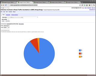
Where would data viz journalism be without Google? Flashy visualizations were once many newsrooms’ go-to solution for news’s rapid transition to digital. Cloud-based web services that crank out embeddable visualizations was an easy, cost-effective route. Google Fusion Tables was a favorite. With a Google account, newsrooms could create embeddable charts, maps and tables for FREE. A host of storytelling-oriented web services appeared around that time. Some like Storify and Thinglink really tried to push the boundaries of digital content.
Behind the scenes, downloadable tools like Google Refine and DataWrangler allowed data journalists to quickly collect and clean large amounts of data that could be saved as csv files and added to the embeddable tools. This meant digital storytelling was as simple as signing up for accounts, and copying and pasting embed codes.
2011: D3 Visualizations
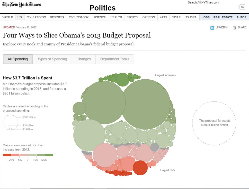
SaaS tools could only do so much for newsrooms. On the other hand, coding custom visualizations from scratch was a time-consuming, work-intensive endeavor. There were tools like Flare and Prefuse, but they required browser plug-ins. That’s where javascript libraries came in. In 2011, Mike Bostock, a New York Times graphics editor and data visualization expert, released the open-source D3.js, a javascript library for building interactive data visualizations. D3 helped users create a slew of charts and graphs using pre-written functions. This gave journalists the option to produce their own custom visualizations for free. It quickly became a staple in news app developers’ toolboxes and likely contributed to the spread of interactive data visualizations on news websites.
2012: Parallax
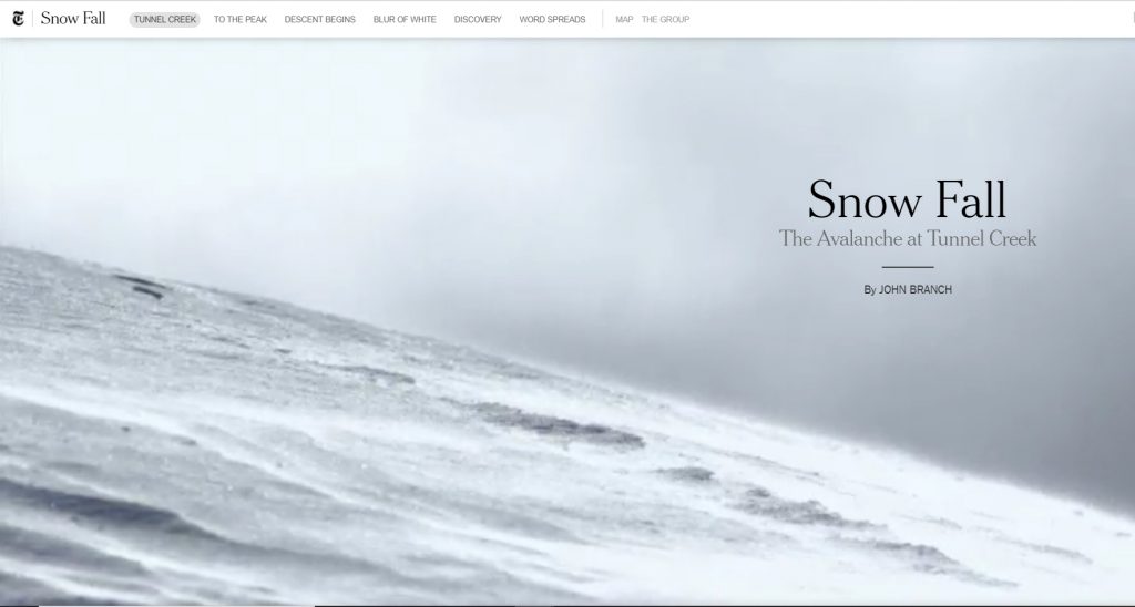
Digital journalism in 2012 could be summed up in two words: “Snow Fall.” The New York Times’s groundbreaking masterpiece raised the bar for visual storytelling. Largely driven by full-screen videos, 3D animations and parallax (when a foreground moves at a different rate than the background), “Snow Fall” showcased some of the first examples of what would become standards in online visual storytelling. The piece won a Pulitzer Prize and showed news nerds that possibilities in the field were endless.
2013/2014: Visual-driven Longform
“Snow Fall” was not perfect. While inspirational, it had its critics. Many argued that “Snow Fall” and the slew of copycats that followed put too much emphasis on bells and whistles and were not scalable. So newsrooms started trimming the fat. Visual-driven longform that was less-ambitious, but just as captivating as “Snow Fall,” was everywhere. At Vox Media, brands like SB Nation and The Verge put more resources into scaling their longform pieces, even designing a custom CMS to accommodate it.
2015: The Anti-Aesthetic
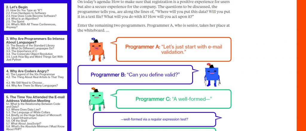
When Bloomberg LP acquired Businessweek in 2009 it wanted to rebrand the magazine as something unusual. The result was an irreverent, tongue-in-cheek creative tone. This credo ultimately led to the website’s controversial redesign in 2015, headed by Joshua Topolksy. The revamp, like the print redesign, embraced the ugliness of retro graphic design. The 2015 piece, “What is Code?” exemplified the aesthetic best, shamelessly showcasing harsh colors, obnoxious cartoon caricatures, and minimalist sidebars. Other works like its feature on economist Paul Krugman and later The American Mall Game paid homage to early video game graphics.
Other organizations also embraced the (anti-)aesthetic, including the generally discerning New York Times. Though the approach remains highly polarizing. Topolsky ended up leaving Bloomberg after only a year over creative differences with the company’s eponym Michael Bloomberg, bringing his intentionally-tacky modus operandi to his own venture The Outline.
2016: The Snapchat Look

The mobile app Snapchat emphasizes visual communication by enlarging multimedia elements and letting users navigate series of visuals via touch. As the popularity of the app grew, newsroom designers took notes. Suddenly news giants were building story pages that looked and functioned suspiciously like Snapchat. They were clearly designed mobile-first and emphasized swiping and tapping for navigation rather than scrolling. The mobile-friendly design approach is often the go-to choice for newsrooms, nowadays.
2016/2017: Chatbots
Mobile smart devices were commonplace by mid-decade. Naturally, tech companies set out to make devices even smarter. Innovations in Artificial Intelligence (AI) and machine learning were suddenly supposed to be the future. Some news media were sure to get ahead of the trend. In 2016 Quartz launched its first chatbot studio, the rationale being bots and AI were the center of a new era of mobile technology. Newsrooms at the BBC, Forbes, Buzzfeed and others got to working on their own bot technologies.
Most of the bots used existing messenger services like Facebook Messenger and Slack. A lot of bots were developed in partnership with corporate sponsors, giving newsrooms hope that they could sell the AI tools and possibly introduce a new revenue stream to an industry seeking all the lucrative ideas it can get.
This era also highlighted the trend of news orgs starting experimental labs and studios. Sure, visual storytelling teams specialized in creating amazing data-driven visuals, but the digital world was moving beyond browsers and toward smart devices, AI and virtual reality. Many newsrooms wanted to be prepared.
2017: Supersized Illustrations
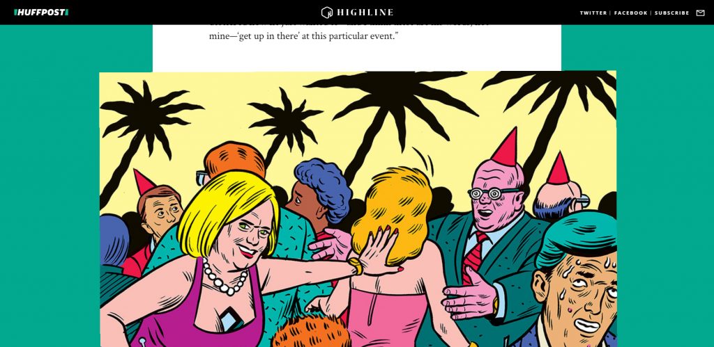
Toward the end of the decade it seemed like more and more longform-driven news outlets were avoiding building elaborate packages from scratch and instead trying to draw attention to vivid photos and illustrations. Longform journalism suddenly featured enlarged, powerful photojournalism and striking drawings. Sometimes they’d be presented as gifs that moved slightly or built in layers to give off a parallax effect.
This was around the time Topic magazine launched (2017). That multimedia website vowed to produce a monthly collection of visual-driven stories featuring illustrations, video and photos. Meanwhile organizations like the Huffington Post’s Highline were regularly producing longform features with stunning illustrations, like its report on workplace harassment at HSBC Bank. Full-page header images and breakout illustrations became common. Visual-storytelling projects were becoming low-lift.
2017/2018: Fiction and Fun
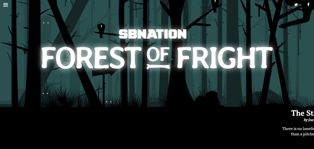
Digital storytelling–what with its emphasis on images, design and interactivity–really lends itself well to fantasy. It makes sense that by the late 2010s so many newsrooms were experimenting with fact-inspired fiction. Perhaps the most influential speculative fiction pieces of the decade was SB Nation’s “17776,” an interactive, multimedia-driven sci-fi story about the future of football. SB Nation also published a series of Halloween-inspired tales the next year.
Meanwhile choose-your-own-adventure-style news games took off. The Financial Times, Propublica, the BBC and Bloomberg developed fiction-based narrative games designed to teach readers about different news topics.
It’s probably no coincidence that fantasy became a journalism trend toward the end of a decade overshadowed by political upheaval and division. Games and fiction allowed readers (and journalists) to take a break from the exhausting news cycle and have a little fun. This was partly why The Verge launched “Better Worlds,” a sci-fi fiction anthology about the ways technology could actually improve the world rather than bring it down. As The Verge’s editor-in-chief Nilay Patel put it: “Everything today is so dark. The news is terrible. The TV shows are grim. Even the superheroes are ridiculously dark…Better Worlds will pull together some of biggest names in sci-fi to bring positive new light and thinking on what’s to come.”
2019: Scrollytelling
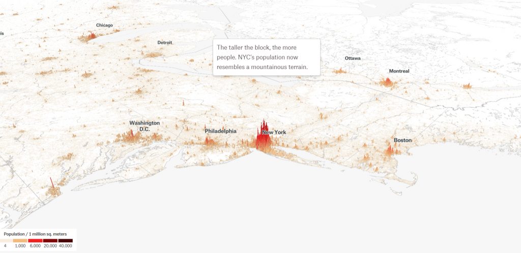
So-called scrollytelling had been around for the better part of the decade. It’s a broad web development technique in which on-screen visuals are altered by users’ scrolling. There are all sorts of implementations of this concept, but toward the end of the decade newsrooms seemed particularly heavy-handed with one, in particular. In this style, text scrolls over images, maps and videos, which stay in place until users reach certain points in the story; then the visuals change or animate. The New York Times is a big proponent of this storytelling method. It felt like a lot of NYT visuals in 2019 incorporated it. But the folks at The Pudding practically wrote the book on it, and are just as staunchly attached to the style as the Times. It’s no surprise that in 2019 all of the winning entries for The Pudding’s annual contest for the best independent visual storytelling incorporated the publication’s preferred style of scrollytelling.
Scrollytelling has a contemporary wow factor and with libraries and/or reusable code it’s easy to reproduce. That’s probably why it appears so much nowadays. Whereas 2012’s “Snow Fall” took more than a dozen team members and six months to make, today’s visuals can be replicated and tweaked by small teams, even independent developers. This is one sign that in the 2020s the days of large, expensive visual storytelling teams will be numbered.
The 2020s: Future Digital Journalism Trends
People have not only begun to embrace the web, but are building much of their lives around it. As we enter 2020, society is more ready than ever to digitize the world around them. Even ordinary objects like light bulbs and doorbells are becoming technology-controlled, internet-connected smart devices.
Journalism is being “saved” in the process. Talks of a “dying industry” and the need for a “new business model” have waned as society opens its arms to the never-ending stream of information flowing from our web-driven world. Journalists, particularly those at national, digital publications, no longer have to “wow” and use flashy, elaborate projects to capture readers’ attention–and readers are probably not all that impressed with those things anymore, anyway. Many digital-first media companies are therefore expanding their definitions of “content” and diversifying revenue streams using things other than news apps and visualizations.
Here’s what digital journalism might look like in the 2020s:
Shrinking Visual Storytelling Teams
At the start of 2010, there was a huge demand for code-writing white knights to ride about the journalism realm and rescue the industry from the deadly flames of technological explosion. These days, not so much.
These white knights, aka news apps teams, are incredibly expensive, and often take a notoriously long time to turn-around work–and for what gain to the newsroom? Additional pageviews? Praise from the media elite? An award or two, perhaps?
There is no longer a need to over-invest in risky moonshot ideas for mobile and desktop screens. Plus an ever-changing, perpetually multiplying list of mobile and browser compatibility limitations is only making news apps production (from scratch) longer and more expensive. Newsrooms in the 2020s will start scaling down visuals teams and will look for cheaper, faster alternatives. They will start to invest resources in other in-house products, like shows for video streaming.
Pivot Back to Video (and Social and Product)
Video simply meshes better with today’s devices, web-surfing habits and streaming culture–more so than elaborate data visualizations and 20,000-word visual longform packages. This was an assumption in the last decade that may have backfired, but publishers could make a better-calculated second attempt.
More newsrooms are realizing they are more than news providers, but are sources for content-driven products. So they are starting to expand to platforms beyond the browser. Content is more than a webpage these days, and just like attention shifted from desktop to mobile in the 2010s, it will shift again in the 2020s. As newsrooms begin investing less in expensive news apps and interactive graphics teams, more resources will go to other departments: the video teams, the social media teams, the product teams. This is where the content of the future lies–video streaming services, social networks and strategic partnerships. More resources will be funneled to producing media products like TV shows, content-driven marketing campaigns, and publishing tools to sell to third parties and complement revenue from reporting (the quick and painless kind). These things make direct revenue, rather than simply increase pageviews temporarily.
Reproducibility
Another reason visual storytelling teams will be less momentous in the 2020s is that much of what they have historically produced are nowadays being templated and automated. Thanks to frameworks like React and Ruby Rails, developers are able to save themselves hours of work by simply designing projects as blueprints they can later tweak and re-use.
Pretty soon, a lot of what news apps teams will be doing is updating old apps, and using old designs for new stories, simply swapping out the data. Of course managers will see value in this practice because “cool” projects will no longer take 10 designers, 20 engineers and 3 project managers to complete.
Many newsrooms have already begun designing in-house tools that allow the least tech-savvy of editors to quickly build visual-driven packages straight from the CMS. Others have settled on designs from their robust repertoire of work and have already implemented workflows to re-use them when needed.
The Rise of Immersive Journalism
Ultimately the future of digital journalism will reflect the future of society at large. This is looking more and more like a world in which people are totally, as in physically, immersed in technology.
Rather than designing things for screens, experts will start designing for the tangible world. Newsrooms will start investing more resources into things like WebGL projects, 3D mapping, virtual reality, augmented reality, and 360 video. These things work to extract the digital world and bring them to our world, or vice versa, immerse us in digital worlds. Children who grew up talking to machines as toddlers will expect to be able to give and receive information to and from devices on a regular basis. Newsrooms will realize that they will have to be present for these consumers, and many have already been trying to get ahead of the curve.
This isn’t to say that visual storytelling professionals won’t have work in the 2020s. It’s to say that the work might not be as adventurous as it was in the 2010s. News developers will have to expand their craft, including possibly learning to shoot and edit (360) videos, using APIs and coding languages they aren’t used to, or designing 3D graphics. They will have to become high-level-minded visual story-tellers and not just practical story-builders–and they will have to learn to like it.
All images are screen caps used under the Fair Use doctrine of Copyright law, unless otherwise noted.
