Despite daily televised updates and frequent data dumps, Mayor Bill de Blasio and the city of New York have been hesitant to publish neighborhood-level stats showing the impact of COVID-19 on the four boroughs. That is until yesterday afternoon, when the Department of Health and Mental Hygiene released zip-code level COVID-19 data via its Github page. They were even so kind as to release a choropleth map of the data. But look closer at the map and you realize that everything is not what it seems.
Reporters have been asking the city for this data for weeks, but the city had declined, opting instead to release a terribly misleading PDF map of their figures. I won’t break down everything that was wrong with that thing here (Patch lays out the basics here), but suffice to say, it was useless. On Monday I submitted a Freedom of Information Law request to the Department of Health and Mental Hygiene requesting daily, neighborhood-level COVID-19 data. I figure others have done the same. Nonetheless, two days later, the city finally released something we can work with.
The problem is that the corresponding map the department released (and that many shared on social media) yesterday only tells part of the story.
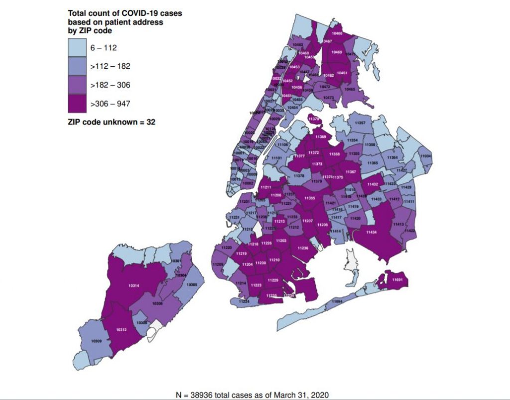
Here is the map in question. It shows the number of positive COVID-19 tests (out of total tests) throughout the city, by zip code. I’m not sure which classification method they chose, but the result looks similar to the “quantile method,” in which all the units are divided into four or five equal or close-to-equal groups. With this method we see which zip codes fall into each group. From this map it appears that much of Brooklyn and western Queens have some of the highest numbers of COVID-19 cases. Otherwise, what we see is that much of New York has it bad. I pulled the numbers and made my own map using a more genuine quantile method. The results were similar.
The problem with using a quantile method though is that it only tells part of the story: assuming all or much of New York City is affected by a COVID-19 outbreak, let’s divide the zip codes (neighborhoods) equally into 4 groups, showing which zip codes are in the lowest-tiered group, which are in the second-tier, and so on. With this approach the result will show that all neighborhoods contribute in some way.
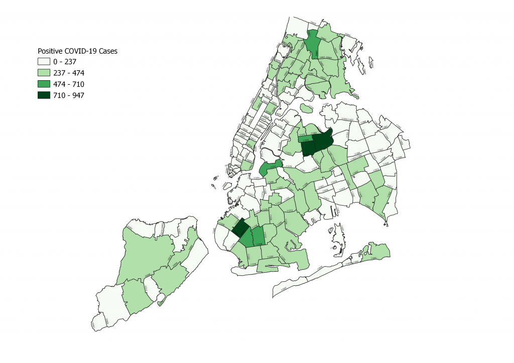
But another way to create this choropleth map is by using the “equal interval method.” This takes the maximum value and creates a range divided into four or five parts. We can then see where each zip code falls on this range, regardless of the other values. Unlike the quantile method the equal interval method tells us whether some zip codes skew one way or the other, or if there are outliers.
The distribution of New York City’s COVID-19 cases on this kind of map tells a completely different story. Now we can see that most zip codes in the city have reported fewer than 474 positive cases as of March 31, 2020. However, there are a few, and only a few, zip codes with more cases than what we see is common. The zip codes serving the Borough Park, Midwood and Mapleton show a larger number of cases than the rest of the city. Over in Queens, the Corona, Elmhurst and Jackson Heights neighborhoods also have relatively high numbers. Then there is Williamsburg Brooklyn and the Norwood area in the Bronx, which also have an unusual number of positive cases. Many might stop there and draw conclusions, but this map is still not good enough to make observations.
Zip Code Map of NYC COVID-19 Cases: Equal Interval Edition
We can’t jump to conclusions on total number of cases alone. Since some zip codes in the city have higher population than others, the data should be adjusted relative to the local population.
The city publishes population data by zip code as part of its zip code boundary dataset. I used this data to estimate (the data was last updated in 2018) the population for each zip code, creating another equal interval map, this time using positive COVID-19 cases in each zip code, per 1,000 residents. The results are eye-opening and unlock more interesting details.
Per Capita Equal Interval Map Tells Even Clearer Story
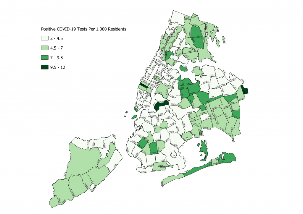
Suddenly, the number of cases in Borough Park and the Elmhurst areas, while still higher than most of the city, don’t look as high when compared to Williamsburg or the Garment District in Midtown/Hell’s Kitchen.
What’s happening in these areas? There can be a variety of possibilities, ranging from class, wealth, and cultural intricacies, to accessibility and density issues. The Borough Park and Williamsburg areas have large hasidic Jewish enclaves, for instance, while the hardest-hit areas in Queens have big immigrant communities. In Queens it’s not uncommon for large families to live together and for residents to work service jobs that require them to leave home, as opposed to “working from home” like corporate workers.
When the city released its data, many speculated that the map was proof that poorer communities were hit harder. I don’t know about that. It would take more digging to make a conclusive call. The data shows that much of the city has been impacted regardless, and that the outbreak isn’t confined to one part of it. Though others have also claimed that wealthier people are getting their hands on more tests while poorer people are not, possibly affecting results.
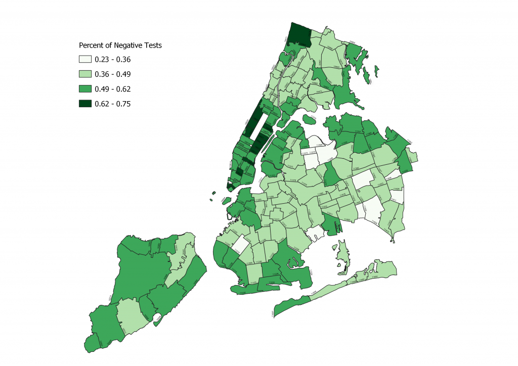
So I created another map showing the percent of negative test results per zip code. Zip codes with the highest negative test rate are in some of the city’s wealthiest neighborhoods, with negative results as high as 75 percent of total tests. This could suggest that more people in these areas are getting tested when they don’t need to (but who knows, maybe people in other communities simply aren’t as paranoid). The Upper West Side and Upper East Side show particularly high negative test rates.
Richer Neighborhoods Test Negative More Often
At the end of the day, the novel coronavirus has affected all of New York City to some degree, and that’s evident in the any version of the map. While some areas have higher positive results per capita, in the grand scheme of things they make up only a small percent of the total number of cases invading the city. To date, New York City has more than 44,000 cases of COVID-19, which has resulted in more than 1,300 deaths. This has been spread out across the boroughs.
Some caveats about the data: The zip code dataset doesn’t account for all cases documented in New York City. Some 5,000+ cases in the city’s official totals are not accounted for in the data. The data shows only those who were tested in New York City hospitals. Then there is the fact that many people living with the virus may be asymptomatic or simply not getting tested, and therefore aren’t showing up in the data. The data, especially the population numbers, also don’t account for so-called transplants who have gone back “home” to be with their families during this crisis.